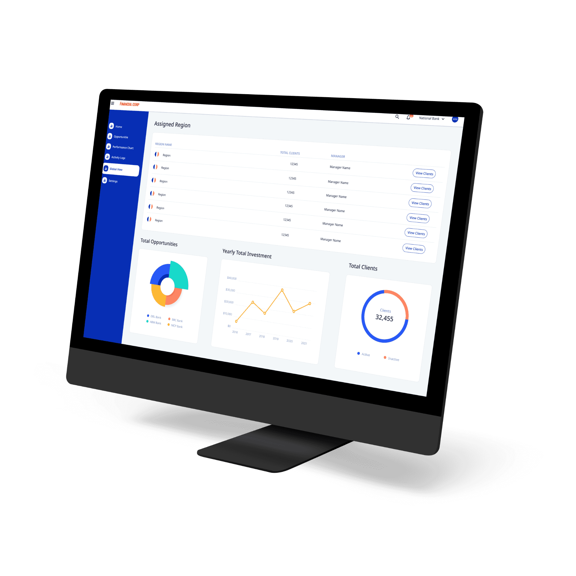
In the fast-paced world of financial services, access to precise, well-organized data is essential for effective decision-making. This project, designed for a prominent financial services organization, aimed to redesign an internal dashboard to improve usability, enhance data accessibility, and increase employee efficiency.
Client
Financial Services Organization
Role
Lead UX/UI Designer
Year
2024
Toolkit
Figma – for wireframing, prototyping, visual design
Overview
Challenges
The project presented unique challenges:
User research was minimal and consisted mainly of conversations with client representatives to understand their immediate needs.
Instead of starting with low-fidelity wireframes, I began directly with high-fidelity wireframes to accelerate development and ensure that visual elements met the company’s brand standards.
The dashboard presented intricate data points, and it was essential to organize this information intuitively, enabling users to access insights efficiently without overwhelming them.
Design Process
Initial Client Discovery: I engaged with client representatives to understand the specific functionalities required by employees using this internal platform. These discussions provided insights into existing pain points and highlighted the need for more intuitive data categorization.
High-Fidelity Wireframing: Given the focus on UI design, I proceeded directly to high-fidelity wireframes using Figma, adhering closely to the company's branding and providing a consistent, professional look across the dashboard.
Visual Hierarchy: To manage complex data without overwhelming users, I organized content with a clear visual hierarchy, ensuring that key information stood out while maintaining a more intuitive user experience.
Iterative Refinement: Client feedback was integrated into multiple iterations of the wireframes, allowing for refinements that further aligned the design with client goals and optimizing the design for the eventual handoff to development.


